There's really nothing wrong with Museo. In fact, it was named by My Fonts as one of the top 10 fonts for 2008. But this exposure led to greater exposure and eventually landed this font in the "do not use" lists of most respected designers. But we like it anyway. And we're going to use it anyway...but in a way it hasn't been used before. Here's why.
Museo (we use it in our blog title) is strong and assertive. It's modern and speaks to us in a way that screams, "We have convictions that cannot be deterred." So we're sticking with it even though its overexposure suggests we shouldn't.We've decided to move forward with this because we're committed to breaking the rules in a way that help us differentiate ourselves with our new brand. You may be wondering how we'll use an overused font to help us stand out. And that's a valid question. Here's your answer: We can redesign the font and use in a way that is unique to Union College and in ways that no other business or website has used it before. It will be our own and used very sparingly. We'll present options to you in hopes that you'll agree to help us figure out the best way to handle it. But that piece of this grand puzzle will come later. For now, we want you to fully understand why we're committed to this font.
Aside from its strength and authoritative integrity, Museo shares with Union an esprit de corps based on the letter "U." The designer, Jos Buivenga from the Netherlands, was inspired to create Museo because of a daydream where he envisioned the "U" with clean, crisp lines with bent endings to create the serifs (the "feet" at the ends of letters). His creation was an overnight success and got the attention of many graphic artists. It's used now largely by web designers but not in higher ed, at least not that we know of. So in choosing Museo to use in our marketing materials, we don't expect to present ourselves like anyone else in our industry, even if we don't modify the font. To separate us across all categories of business and institutions, our modified version of Museo should help us carve out a unique identity.
I have no idea at this point what our version of Museo will be. We might use thin and thick lines together; we might pair two of our brand colors in the text; we might alter the shape of the serifs. But whatever we choose, we want you to be involved. When options are available, they'll be presented here, and we hope you will help us figure it out.
On a side note, I'd like to clarify that Museo has been chosen as a foundational font to illustrate our marketing message—not our logo. The logo is a separate piece that will have a much longer shelf life than our marketing plan. Generally, a logo and tagline serve as the inspiration for a brand message, and the longevity of the use is long-term. The marketing message that articulates the brand is meant to serve for about five years, give or take. So Museo, in whatever form we use it, will help us tell people that Union is stable and confident by broadcasting messages and pointing to the logo. In a few years, we'll have another font at the helm.
Like it? Tell us what you think. Or if you'd rather respond offline, feel free to shoot me an email: mreid@unionky.edu.
—Missy Reid '91
Union College Director of Communications

Showing posts with label branding. Show all posts
Showing posts with label branding. Show all posts
Sunday, January 12, 2014
Thursday, January 9, 2014
So what is branding?
While educating our college community about the new brand, we included a quick lesson about branding itself. Chances are, you might need a crash course as well. Think of this post as Branding 101: The Bumper Sticker Version.
Not surprisingly, there are a great many folks who think a brand is all about a logo and a cool tagline. Those things are important, but a brand is so much more than that. Marketing materials and logos are merely visual representations of what businesses and organizations want stakeholders to perceive them to be. A brand itself is a perception that lives in the minds of the consumers, and the business has no control over it. A branding effort is an attempt to influence that perception, not just with a visual identity system, but through actions as well. And it won't work unless the business or organization is true to the brand promise. For example, BP worked diligently for years to promote itself as a "green" company, but the public ultimately didn't buy it. Public perception was influenced more by BP's highly publicized environmental negligence. On the flip side, Apple's "Think Different" campaign totally worked (and still does) because the public believes its products are innovative.
I could ramble on for hours about what it means to delve into a branding campaign, but I'll stop for now and take advantage of teachable moments as they arise in future blogs. My intention is to keep you here, after all. But I found a cute video that sums it up nicely, and I encourage you to watch it if you have a spare three minutes (the running time says it lasts more than five minutes, but it actually ends at 2:55).
Let's switch gears now as I unveil something new about the new brand: A lot of things are changing at Union College, but our orange isn't one of them. We're still Pantone 165—the same color on this blog's background. While we haven't taken colors away, we have added a few. One of them is the purple you see in this blog's dateline. This color will be used as an accent in marketing materials and various other applications. Here's a better look at it.
 Why purple? It's all about the brand. One of our goals in influencing public perception is to demonstrate that we are truly committed to our region. We've implemented and continue to develop new programs that prove this commitment, so we're completely confident in building in a visual representation to illustrate this through the brand. And we're confident enough to broadcast what this color means. Here it is: When we tinkered around in Photoshop using Union's orange and the blues owned by Barbourville Independent and Knox County schools, we came up with this amazing and majestic purple—we call it "High School Spirit." This is a color that symbolizes solidarity among Knox County's educational institutions, and we love it. (That's why we're presenting it here in a heart shape, by the way, which is not the norm.)
We actually developed an entire color palette inspired by Union's values. We'll show you more as time goes on, but for now, we'd love to know what you think, as it's not too late to add or substitute colors. Is there another color you have in mind to help us convey Union's commitment to Knox County and Appalachia? Leave us a comment with your recommendation, along with a rationale. We live for that kind of thing.
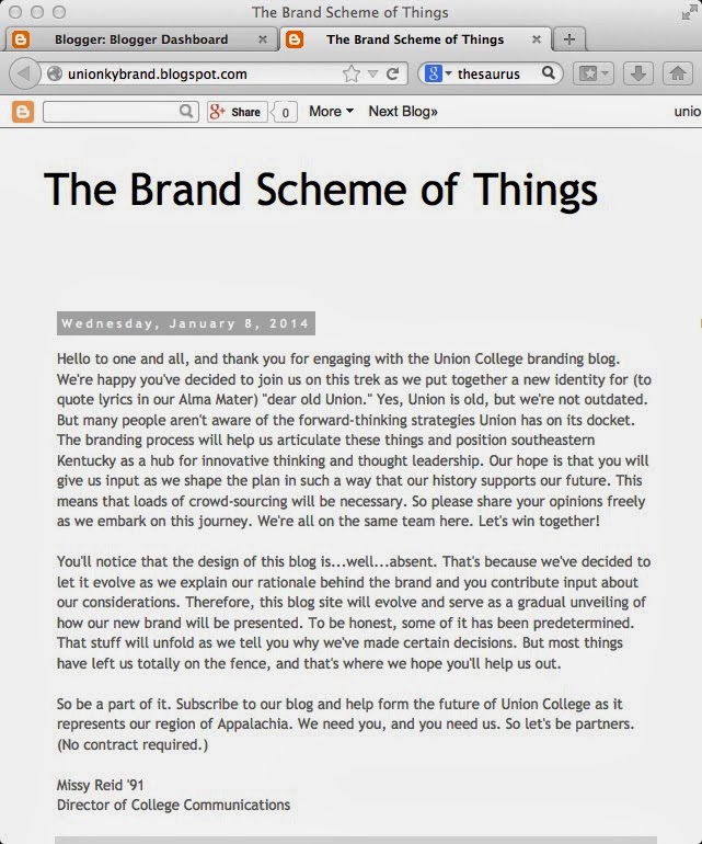
In closing, I've included a screen shot of the last blog post so we can reflect together on the design process. As I explained in my first post, this blog will shape up as I introduce you to elements of our visual identity that we've determined so far.
Missy Reid '91
Director of College Communications
Not surprisingly, there are a great many folks who think a brand is all about a logo and a cool tagline. Those things are important, but a brand is so much more than that. Marketing materials and logos are merely visual representations of what businesses and organizations want stakeholders to perceive them to be. A brand itself is a perception that lives in the minds of the consumers, and the business has no control over it. A branding effort is an attempt to influence that perception, not just with a visual identity system, but through actions as well. And it won't work unless the business or organization is true to the brand promise. For example, BP worked diligently for years to promote itself as a "green" company, but the public ultimately didn't buy it. Public perception was influenced more by BP's highly publicized environmental negligence. On the flip side, Apple's "Think Different" campaign totally worked (and still does) because the public believes its products are innovative.
I could ramble on for hours about what it means to delve into a branding campaign, but I'll stop for now and take advantage of teachable moments as they arise in future blogs. My intention is to keep you here, after all. But I found a cute video that sums it up nicely, and I encourage you to watch it if you have a spare three minutes (the running time says it lasts more than five minutes, but it actually ends at 2:55).
Let's switch gears now as I unveil something new about the new brand: A lot of things are changing at Union College, but our orange isn't one of them. We're still Pantone 165—the same color on this blog's background. While we haven't taken colors away, we have added a few. One of them is the purple you see in this blog's dateline. This color will be used as an accent in marketing materials and various other applications. Here's a better look at it.
We actually developed an entire color palette inspired by Union's values. We'll show you more as time goes on, but for now, we'd love to know what you think, as it's not too late to add or substitute colors. Is there another color you have in mind to help us convey Union's commitment to Knox County and Appalachia? Leave us a comment with your recommendation, along with a rationale. We live for that kind of thing.
In closing, I've included a screen shot of the last blog post so we can reflect together on the design process. As I explained in my first post, this blog will shape up as I introduce you to elements of our visual identity that we've determined so far.
Missy Reid '91
Director of College Communications
Subscribe to:
Posts (Atom)