
Not surprisingly, there are a great many folks who think a brand is all about a logo and a cool tagline. Those things are important, but a brand is so much more than that. Marketing materials and logos are merely visual representations of what businesses and organizations want stakeholders to perceive them to be. A brand itself is a perception that lives in the minds of the consumers, and the business has no control over it. A branding effort is an attempt to influence that perception, not just with a visual identity system, but through actions as well. And it won't work unless the business or organization is true to the brand promise. For example, BP worked diligently for years to promote itself as a "green" company, but the public ultimately didn't buy it. Public perception was influenced more by BP's highly publicized environmental negligence. On the flip side, Apple's "Think Different" campaign totally worked (and still does) because the public believes its products are innovative.
I could ramble on for hours about what it means to delve into a branding campaign, but I'll stop for now and take advantage of teachable moments as they arise in future blogs. My intention is to keep you here, after all. But I found a cute video that sums it up nicely, and I encourage you to watch it if you have a spare three minutes (the running time says it lasts more than five minutes, but it actually ends at 2:55).
Let's switch gears now as I unveil something new about the new brand: A lot of things are changing at Union College, but our orange isn't one of them. We're still Pantone 165—the same color on this blog's background. While we haven't taken colors away, we have added a few. One of them is the purple you see in this blog's dateline. This color will be used as an accent in marketing materials and various other applications. Here's a better look at it.

We actually developed an entire color palette inspired by Union's values. We'll show you more as time goes on, but for now, we'd love to know what you think, as it's not too late to add or substitute colors. Is there another color you have in mind to help us convey Union's commitment to Knox County and Appalachia? Leave us a comment with your recommendation, along with a rationale. We live for that kind of thing.
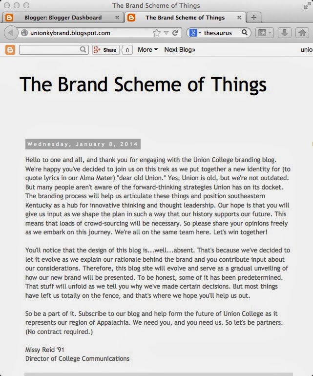
In closing, I've included a screen shot of the last blog post so we can reflect together on the design process. As I explained in my first post, this blog will shape up as I introduce you to elements of our visual identity that we've determined so far.
Missy Reid '91
Director of College Communications

